Brand Identity - Fabel

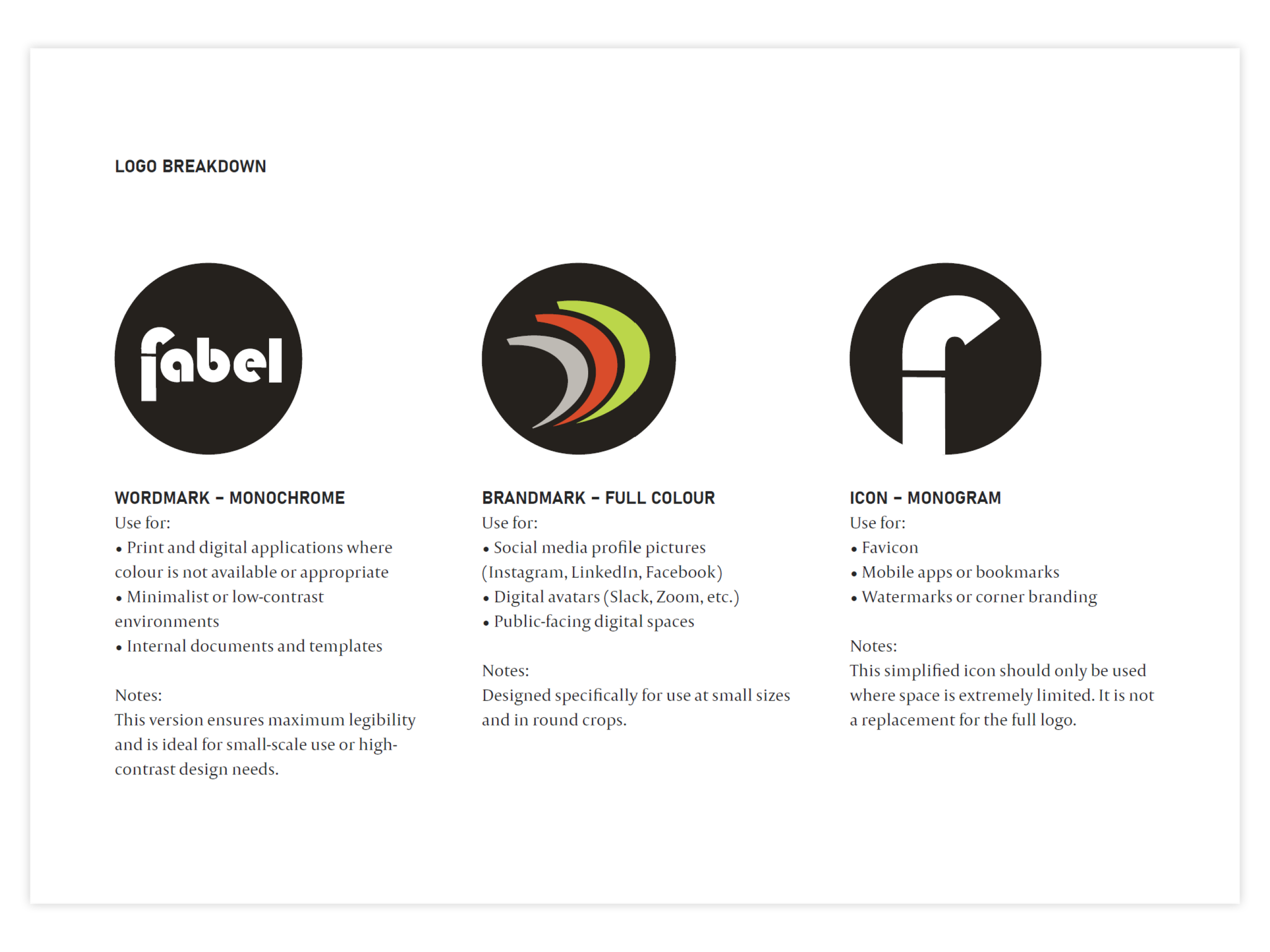
Logo Design
Brand Elements
Brand Guidelines
Fabel is a clever new initiative created by Craig Wealands - former owner of Thirsty Crow, to strengthen Wagga’s hospitality and entertainment sector by bringing venues, creatives, producers and locals together. Built around the idea of Food And Beverage. Entertainment Life, Fabel’s purpose is to create momentum across the region: more collaboration, more opportunities, and a more connected community.
The project needed a clear and confident identity that could stand behind everything Fabel aims to do - from supporting local businesses, to hosting events, to building pathways for emerging creators.
Brand Challenge
The identity had to achieve several things at once:
Feel welcoming and community-driven, not corporate
Carry enough presence to unify many venues under one initiative
Be energetic and forward-moving, reflecting Fabel’s mission
Work across digital, print, events and social media
Have a bold personality, but still sit comfortably beside individual venue brands
Be instantly recognisable, even at small sizes or in busy environments
Above all, the brand needed to speak to a wide range of people - business owners, creatives, hospitality workers, musicians, producers, and the general public - without leaning too far into any single demographic.
The identity was built around three core ideas :
Momentum
Fabel is an active initiative. It’s about energy, movement and pushing the local industry forward.
The curved visual forms express this sense of pace - a brand that’s not standing still, but driving change and collaboration.
Community and Connection
The typography is bold, approachable and modern, reflecting a collective voice rather than a corporate one.
The overall feel is warm and contemporary, designed to be used confidently across venues and community spaces without overshadowing their own identities.
Visibility and Versatility
The colour palette introduces vibrancy and impact. It was intentionally chosen to stand out in social feeds, event signage and promotional content.
The system works in full colour, monochrome and small-scale contexts, ensuring Fabel remains consistent wherever it appears.

Impact
With the launch of the new identity, Fabel now has a foundation that matches its ambition: one visual language representing collaboration, momentum and community.
The brand gives the initiative clarity, cohesion and confidence, helping it communicate its purpose while inviting people across Wagga’s food, beverage and entertainment sectors to get involved.
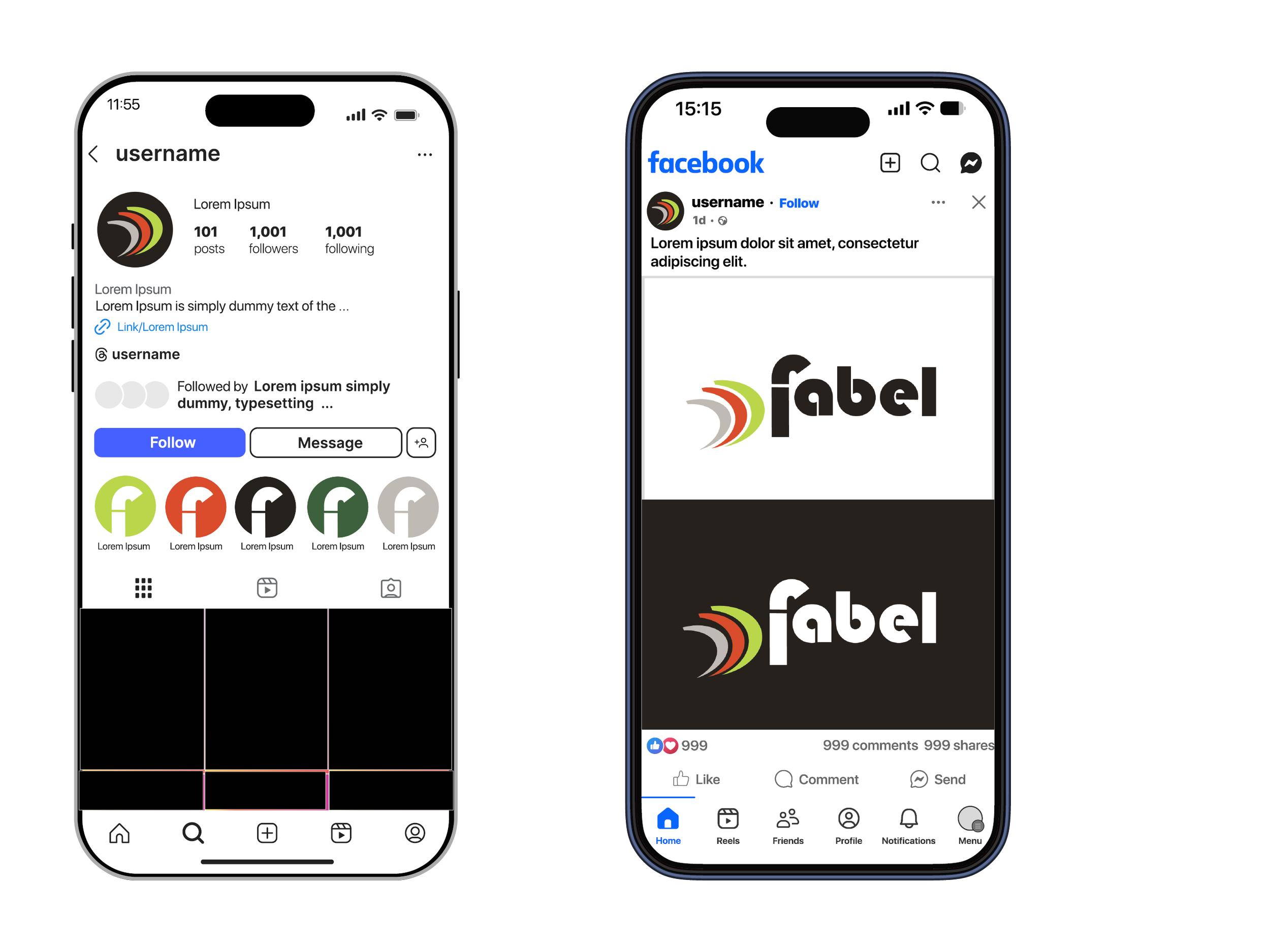
Branded Icons
The icons are built from the same shapes and colour palette as the main FABEL mark. This keeps everything visually connected and easy to recognise. Each icon uses one core brand colour, which helps organise content while keeping the look consistent across the profile. The result is a simple, flexible set of highlight icons that feel clearly part of the FABEL identity without adding visual noise.
Design Outcome
The final identity gives Fabel:
A strong, recognisable name at the centre of all communication
A sense of forward motion that reflects what the initiative is doing for the community.
A bold visual presence that holds up across digital and real-world environments.
The flexibility to expand into events, partnerships and future programs
A contemporary, energetic feel that aligns with younger creatives without excluding broader audiences.
The system has been designed to grow with the project as Fabel continues to evolve.